By Lambert Streher of Corrente.
Readers enjoyed my previous semi-autobiographical post on “writing tools” (reference works like the OED) so I thought I would stumble my elided way further on down the road to creating what today we call content (but was, back in the day, lacking a unifying abstraction,called, depending on where “it” was in the production process, writing, or copy, or type, or galleys, or pages, or newspapers, etc.). Of course, my focus is old-fashioned, and textual; today, “creators” — vile term; the creator/creation is always platform dependent — make content in many media, including not only text, but images and video. (I don’t know why musicians aren’t called creators, but so it goes.) Anyhow, the art and crafts of making words into type will doubtless endure, in some form, no matter what is to come, when data center-dependent media stutter and wither in the heat:
Tempted to buy an old letterpress machine to start making a monthly snail-mail newsletter. Entirely offline. Payment by mailed check/ gift card, or local cash/ barter only.
Making a living as a writer online has been a blessing, but the whole “cashless economy” thing scares me.… pic.twitter.com/NbzhRo63To
— 𝙷𝚒𝚌𝚔𝚖𝚊𝚗 (@shagbark_hick) September 17, 2024
But this post is about the transition from analog to digital type, and digital is what content will be, for the forseeable future [snort]. After I rolled down College Hill and ended up in the mills, I retained some of my academic connections, even though they had gone on to grad school in Boston, and we corresponded; I read their theses, and so forth. I started out by writing letters in long-hand, but that was laborious, and somehow (I don’t remember how) I acquired an IBM Selectric Composer (not the mere Selectric but the Composer):
The Composer was metal and weighed a ton. From IBM’s “The IBM Selectric,” the machine struck the paper with
a spherical element [“ball”] measuring 1⅜ inch in diameter. When a typist pressed a key, the sphere would instantly tilt, rotate and progress across the page to ensure that the proper character would be imprinted in the appropriate spot, eliminating the need for a moving carriage. To minimize the rotation of the type element, lowercase letters were arranged on the front and uppercase letters on the back. The type element was made of molded plastic and blasted with walnut shells — sand would have been too abrasive — to remove burrs. The last step was chrome-plating, for durability. The type element didn’t strike with as much force as type bars, so IBM’s type designers lengthened some serifs and shortened others to make the impressions more equal.
(The process of altering the shape of type to optimize for the composition technology has a very long history, all the way up to the digital era. Also, I love the walnut shells. IBM put an engineer on that, and they figured it out!) Here’s the ball:
This was good type, for its day, and didn’t require hot lead, either. By printing on paper, the Composer enabled the type to be photographed in a large camera, and that image to be transferred to a printing press plate (“phototypesetting”), which you will note is not yet digital:
This highly-modified (and much more-expensive) Selectric produced camera-ready justified copy using proportional fonts in a variety of font styles ranging from eight points to fourteen points.
There were several fonts, and you changed the font by changing the ball. As a bonus, the characters were “proportional”; they could have different widths (unlike a monospace font, like Courier, where “.” is the same width as “M,” which isn’t especially readable (and centuries of craft have gone into making type readable)). This made the Composer suitable for professional work that needed to look better than typewritten but wasn’t worth spending genuine typesetting money on.
Historical sidebar: The “Killian Documents” controversy that took down Dan Rather turned on whether Killian’s military base had a Selectric that supported proportional fonts, or not; the documents, which used proportional fonts, would have been created on it. Readers may correct my memory, which bit rot forces me to rely on, but my recollection is that Killian’s base had my model of Selectric, making Rather right and his detractors wrong, although nobody but obscure bloggers raised that issue at the time. But it’s been years. End sidebar.
This Selectric branch on my golden path petered out, not that I thought I was even on a path at that point, being young and stupid. (Had I leveraged my typesetting knowledge and gotten hired on at the right shop, I’d probably be a Vice President now; just imagine!) I ended up in Boston, and after working in a brake shoe factory for a stretch, I ended at at a weekly “alternative” newspaper — they had such things then, alternatives, I mean, not newspapers — where I started out as a janitor, and then ended up being a sort of coordinator/expeditor for advertising production. (Oddly, there was nobody on the production side with that job, so I worked for the Sales Department.)
The production department had two branches. There was a Typesetting Department that had a row of terminals with keyboards where typesetters sat; they set their copy at the keyboards, and the terminals spat out yellow punch tape, Jacquard-loom style. The punchtapes were then hung on big blue phototypesetting machines, one punchtape per job, and the Master of the Phototypesetter ran the jobs in the order they felt best.
Fonts for the phototypesetting machines were stored not on balls but disks; the disk was opaque; the characters were clear. The punchtape positioned the disk, character by character, and then fired a light through the transparent image of the character onto photosensitive paper, fogging it in the character’s shape (so you see we are still very much in the analog world). When the tape was done, the phototypesetting machines developed and printed the paper, just as if it were a miniature darkroom, and the department smelt of vinegar, like a darkroom. The paper, when spooled out of the machine, was called a galley.
You can see that the Master of the Phototypesetter would rather change the disks as little as possible, and would much prefer long runs of story after story set in the font that content of the newspaper used, rather than running a bunch of dinky little jobs for the ads, all in different fonts, and different sizes. So I had a certain amount of negotiation to do, to keep the other department — the Art Room, that made the ads the Sales Department sold — working smoothly, by coaxing the dinky little jobs from the Master when they were needed. (For example, a client might need to proof an ad, and the only piece missing was on that little yellow punch-tape right there, so could you please run it? “I’ll make it up to you on the back stretch,” as I heard a salesman say once).
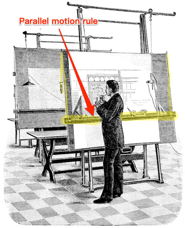
The Art Room had two rows of slanted drafting tables, each with a lamp and a parallel motion rule. Here is an image of a Nineteenth Century drafting table with a parallel motion rule; the implementation is the same today:

Along the top of each table were arrayed — if you love going to stationery stores you will love this — the artists’ border tapes, Rapidograph pens, rubber cement solvent, non-repro-blue pencils, burnisher, pica rulers (metal; transparent), T-Squares, triangles, orange-handled Fiskars scissors, and other cutting implements (X-Acto knives or, my preference, single-edged razor blades). The sound of the typesetting department was the clickety-clack of the keyboards; the sound of the art department the whirr and slap of parallel motion rules being positioned. And music. Like this:
Or this:
The smell of the Art Room was hot wax and metal. Each advertisement was created on a non-repro-blue gridded sheet of smooth cardboard (a “board”). The artist began to create an ad by running a galley through the waxer, which applied hot liquid wax to the back of the galley. Then they cut the type out from the galley and arranged it in a manner pleasing to the eye and the client, along with photographs, also waxed (“half-tones,” a whole other branch of production I’m skipping); the wax was tacky, so the type and the photographs stayed put, but could be repositioned. When the appropriate border tapes, Rapidograph inking, and whiting-out was done, the entire board was burnished with the burnisher (a wooden or rubber roller), wax wiped off with rubber cement solvent, and the board sent off to the Page Makeup Department (which was editorial’s domain, so I could only go through it). Editorial then waxed backs of the ad boards, and burnished them onto the big boards that held the actual pages (galleys, also burnished, plus ruling done with border taoe, and images, standing elements, etc. (When the pages were approved, they were driven to the printer, who, again photographically, turned them into plates for their offset press. Sometimes I was lucky enough to go to the printer’s!)
The key points of manual paste-up technology: All the elements were held firmly in place by wax, and the geometry was enforced by the parallel motion rule, T-Squares, and triangles. The same was true for the Page Makeup Department. So you can see everything is still firmly analog.
Analytical sidebar: Pages were arranged in the Page Makeup Department in order on long slanted tables. One evening, as I was walking past, I saw that one page’s board had all the ads pasted in place, but an overhang of about two feet of galley. Clearly, some writer had exceeded their word count! Would the ads be moved or removed to make space for the words? Or would the writer cut words, and the Typesetting Department rerun the galley? What do you think… So that incident was helped me understand the news business; I was not quite so young, and perhaps not quite so stupid. End sidebar.
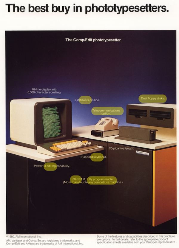
This whole process was called “pasteup” (today, “manual pasteup”) although I suppose it would have been more logical to call it “waxup”; perhaps there’s history I don’t understand. Pasteup was a very useful skill to have for at least a decade or so; in fact, the happiest, most pressure-free job I ever had — at least in those days — was doing pasteup. However, the alternative newspaper business being overly dynamic, my next job was as a typesetter, using the generation of phototypesetters that followed punch-tape. Here, then, is my first computer: The AM Varityper (from a 1980 brochure):

Here, in 1980, you see the most of the elements of an early modern desktop computer: RAM, keyboard, disk storage, modem, monitor (I’m sure you can spot the missing element). I wasn’t a very good typesetter, in fact, if volume and speed were the criteria, I should have been fired. However, the firm did a good deal of mathematical typesetting, and I managed to work out how to program the AM Varityper so as to move the “print head,” as it were, to format and position the fiddly bits of (relatively simple) equations. So that was pretty neat!
The essential point, however, is the transition: By programming the machine this way, I had moved geometry — albeit at the paragraph level — out of the analog realm into the digital: No longer were little bits of type being waxed, positioned, and burnished down; my programming did that; everything came out on the galley in place.
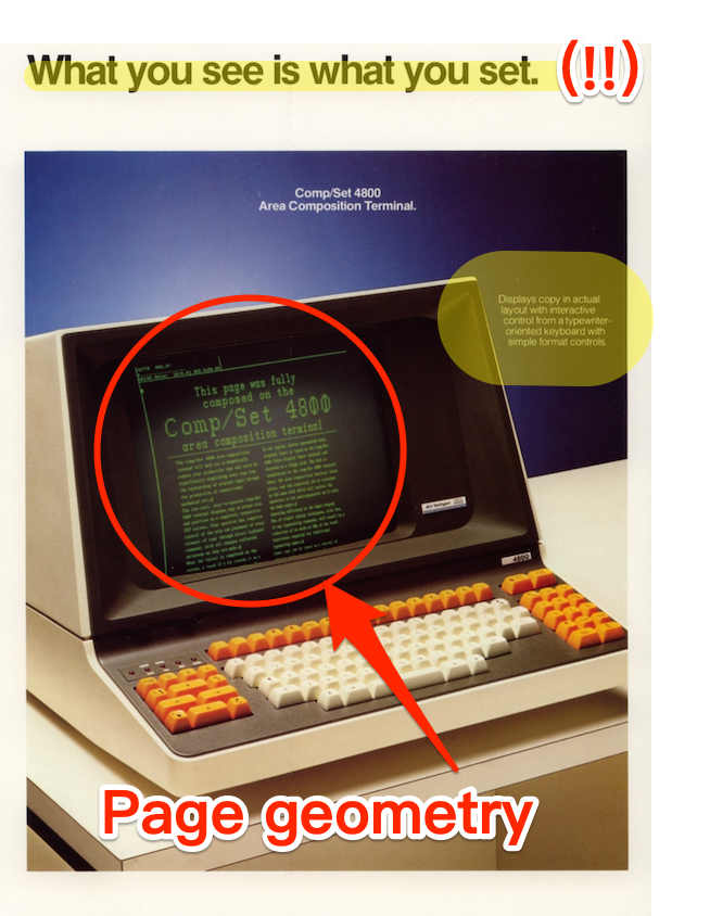
The same transition is visible at the page level in this brochure for the AM Varityper’s final model (“final” because the firm had business difficulties and liquidated). Here it is:

Notice first that now page geometry has been moved from the analog to the digital realm; not the entire page, it is true, but at least the columns of type. Notice also the slogan: “What You See Is What You Set.” The catchphrase apparently originated on the Flip Wilson show, but is it too implausible to consider that Apple’s marketing department, when they ignited (I don’t say “invented”) desktop publishing in 1985 with the introduction of the LaserWriter, had this brochure in mind, given that it applied directly to their target market?
Oh, and we have just seen how we removed page geometry from the analog realm to the digital; but the LaserWriter made the production of type itself digital, as well. (“Laser printers read the electronic data from your computer and beam this information onto a drum inside the printer, which builds up a pattern of static electricity. This attracts a dry powder called toner onto the paper which is then fused using heated rollers”) No more balls or disks!
* * *
As you can see, I really loved the now-vanished world of phototypesetting and manual paste-up; I wish there were a novel about it (though I’m not writing it). I did, however, welcome desktop publishing, because I felt that the essential elements — design, page geometry, choice of typeface — were achieved more cleanly — no more continuous breating of rubber cement solvent! — and productively on the computer.
* * *
These two posts, were, as I wrote, intended to be a single post, and that post was also to include how the Macintosh empowered me as a writer, so I wasn’t only a production guy (and though I say it, a good one). Perhaps the next post, if readers aren’t bored?


